In a nutshell...
__________
Interested in design process? Keep reading! (~5 mins)
__________
Overview
BlueQ is a Melbourne-based startup. Their platform enables individuals and organisations to store, manage, verify and share qualifications in the one online account.
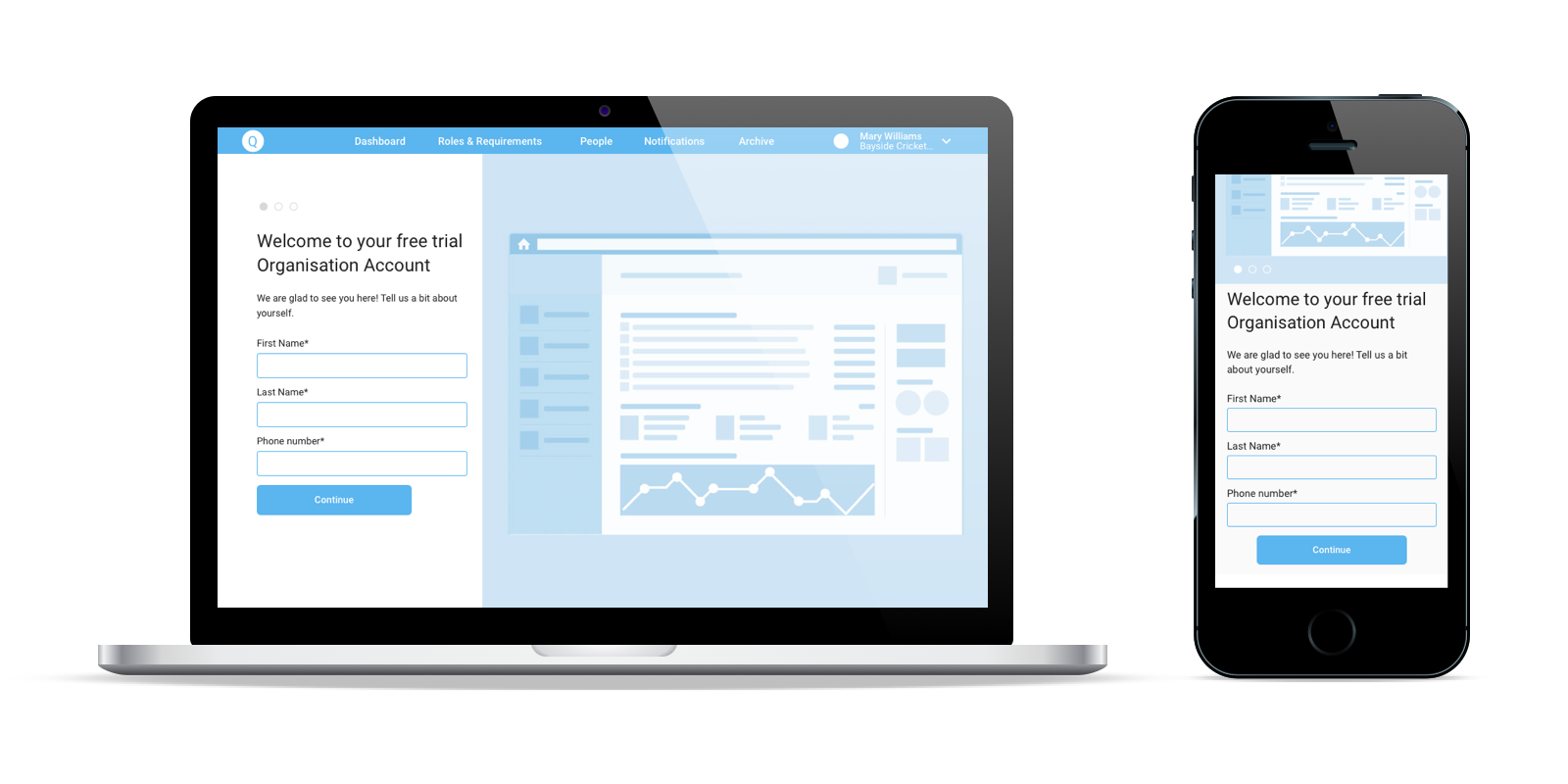
BlueQ hired me to design desktop and mobile user onboarding and create a free trial to paid account conversion workflow.
Problem
BlueQ was launched in January 2016 and since then acquired 160+ client organisations and 7,000 users.
In the interview, the founders explained they were looking to scale and tap into new industries and sales channels, as well as improve conversion along the sales funnel. A serious setback was that the customer support team spent weeks helping every new client get started with the platform.
The following experiences needed to be simplified and made more enjoyable:
• Personal account sign up, uploading required qualifications
• Organisational account sign up, onboarding and setup
• Conversion from free trials to paid customers
Affinity mapping
Role as a UX Designer
• Interviewed founders to define business goals and technological constraints
• Interviewed real users to understand their needs and frustrations
• Reviewed customer support emails
• Synthesised user research into personas and user journeys
• Facilitated an ideation session with the product team
• Created wireframes and low to high-fidelity clickable prototypes for mobile and desktop
• Performed user testing, iterated designs
Duration: 4 months part-time (2 days a week)
Tools used: Sketch + InVision, Axure, Zeplin, Trello
Team: CEO, COO, CTO + Developers (great ideas and advice)
Challenges
• Development of the new version of the app was dictating the timeline
• No direct access to personal account users due to time constraints
Discovery
There was no documented user research when I joined, so I started learning about BlueQ users to know who I will be designing for.
I mapped all user needs and frustrations that BlueQ folks were aware of to proto-personas. These assumptions were then validated through research. We also found the gaps in our knowledge about the users, which had to be filled to enhance BlueQ value proposition.
I had four 1-hour face-to-face interviews with five actual users from sports and healthcare industries. My questions ranged from their job duties to managing compliance in general and experience with the BlueQ app in particular and informed the actual personas and user journeys.
"Sponsor" persona
"Secretary" persona
I created this Excel template to keep track of research insights and record user journey
The biggest surprise was that there turned out to be 2 types of organisational account users, which I called:
• a sponsor, a senior person in the organisation, whose main goal is to build the culture of compliance, a
• a secretary, often a part-time worker, whose job is to actually collect and verify qualifications.
It was exciting to share the insights with the team and make them look through the eyes of their users. I asked everyone to write down “How Might We” questions on cards for the issues worth tackling. In the end, we had a lot of fun voting for the questions with M&M’s to prioritise them for design.
I find this Google Design Sprint technique particularly handy when I want to align the team and make everyone feel heard and involved.
Here are some of the top-voted HMW questions:
• HMW better communicate compliance requirements and what users need to upload to meet them?
• HMW give better system feedback and explain how to fix errors?
• HMW make it easy to capture data and set up accounts in a better way than CSV?
Comparative analysis
I analysed a number of workflows of B2B SaaS apps, like MailChimp, Slack, PipeDrive, Prezi and others to learn:
• how they onboard new users;
• how users can upgrade from a free trial to paid subscription;
• what billing models they use.
Design
I got everyone’s design ideas for those HMW questions and kept them in Trello.
The overall theme for the onboarding was “First Date” because we only have one chance to make a good first impression and earn a second date with our users. I wrote a “Letter from a Happy Customer” to imagine a future user describing their experience with the app to stay focused on the vision.
Design at a glance: Organisational account sign up, onboarding and setup
This task flow was the most complex and important, and its design had two objectives.
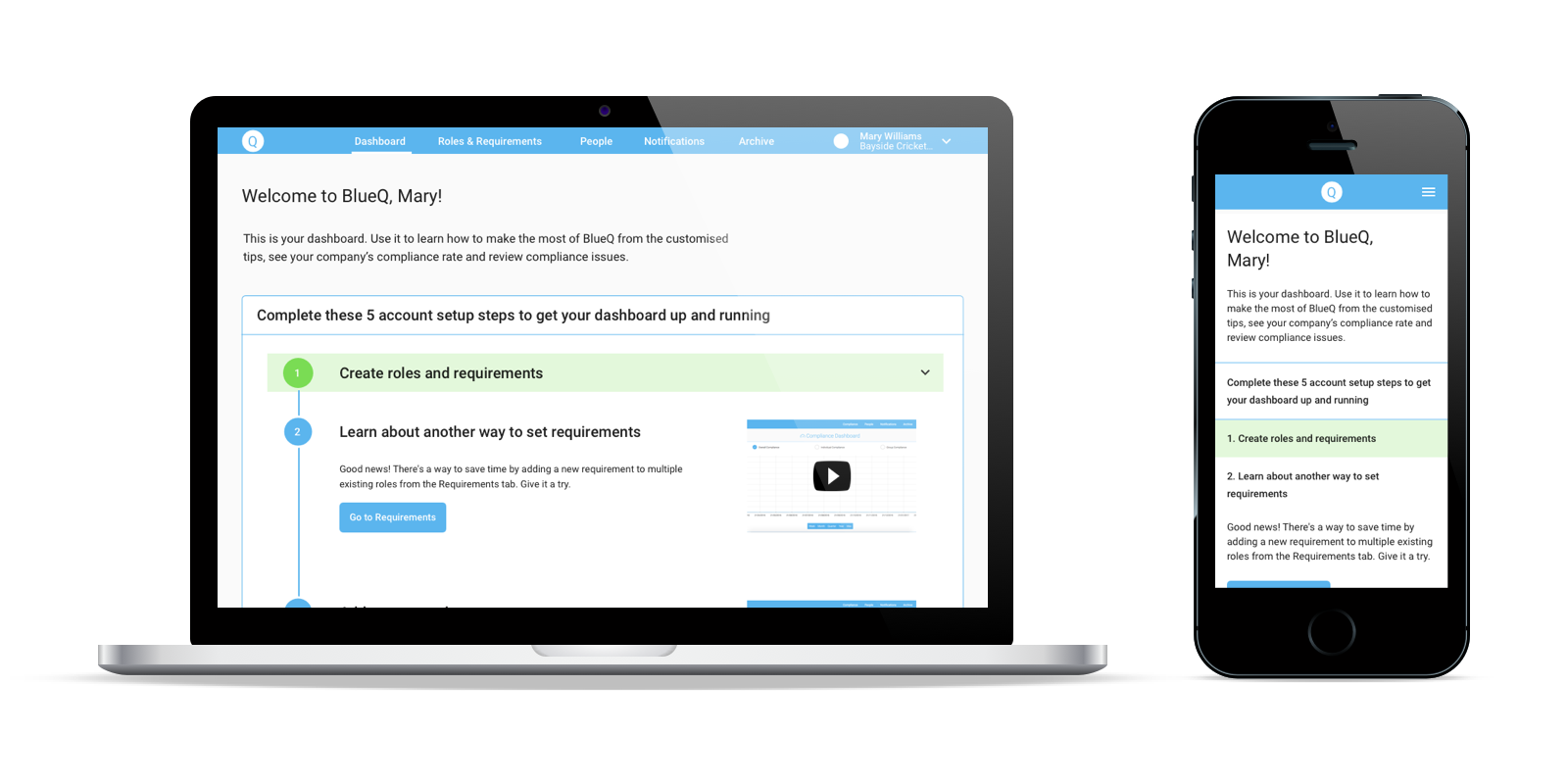
Firstly, BlueQ customer support team onboarded all organisational users because they knew how to do it. I re-designed the information architecture of the app to make important features easily accessible and added new features so that users can complete key tasks themselves (for example, mass-upload employees).
Secondly, it had to get users to the AHA moments of the free trial quickly. Research revealed three most important milestones on the journey to compliance: set up requirements, get up to date, stay up to date. The onboarding wizard gets users to the first one and brings the second and third ones in sight.
Prototyping and testing
I always start with paper sketching. I choose UI elements needed to complete the task and try to arrange them in as many ways as possible. I play with their sizes, positioning and proximity till it looks “right”. To me “right” = intuitive, which is when each element gets the attention it deserves.
I chose two tools for low and high-fidelity interactive prototyping.
I used Sketch (with InVision) for simple task flows. I love the ease of iterating designs in Sketch and sharing them with my developers through Zeplin.
For the organisational account I used Axure. I wanted to make sure interactions were intuitive, and I needed a prototype that would look and feel like a real app. To achieve that, I used some advanced Axure features:
• over 30 global variables for names, role titles, qualifications,
• dynamic panels for the progress bar, screen states,
• conditional logic for displaying suggestions, populating fields, navigation,
• local variables for resizing containers to fit the content.
I was asked to use existing BlueQ style guide for all UI elements.
I completed 2 rounds of guerilla testing for the personal account, and 1 round of testing with real users for the organisational account (and countless tests with the team). After sharing screen recordings with the team, it was decided to fix only critical usability issues in this release.
The solution
New IA and onboarding process for the app, so that new users can onboard themselves with minimum help from BlueQ – including setting up their roles and requirements in a number of ways, inviting their employees to join, and uploading qualifications. Upgrade path from a free trial to paid account.
Business results
“How do we know we have succeeded?” It’s important for me to know that my designs have solved the business problem. We defined new business metrics to measure the impact of the changes we made, including employee response speed and compliance rate at the organisational level.
Next steps
• Make compliance management more intuitive
• Make message across all touch points consistent (email, app)
• Improve user engagement, in particular via action-triggered emails
• Enhance aesthetics and visual identity
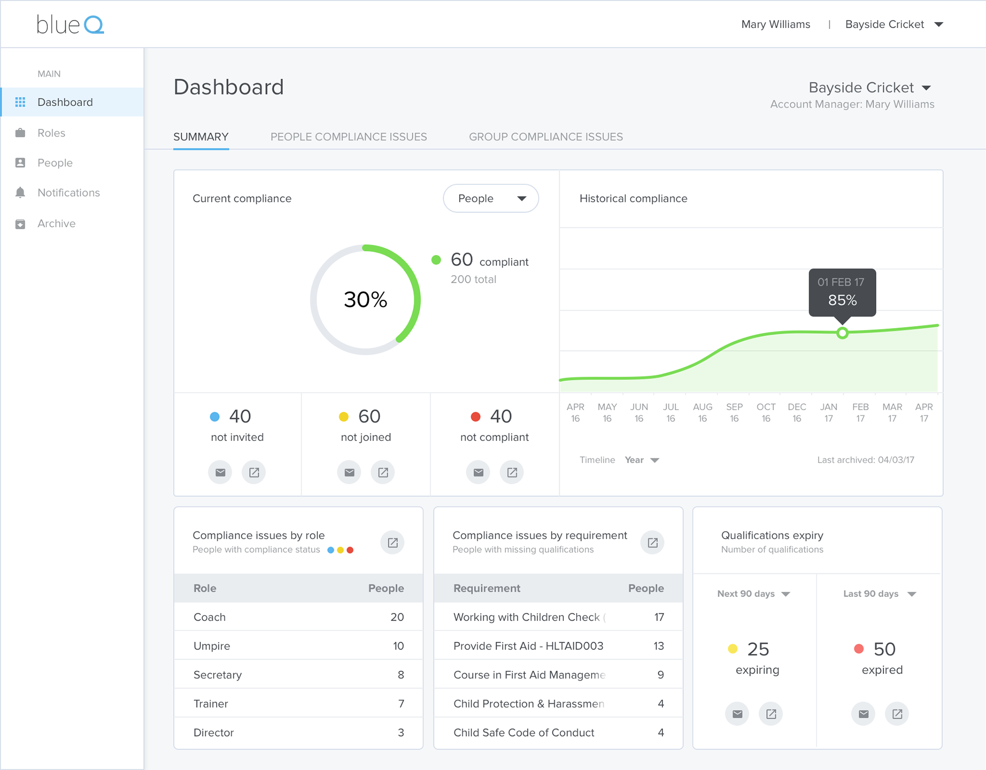
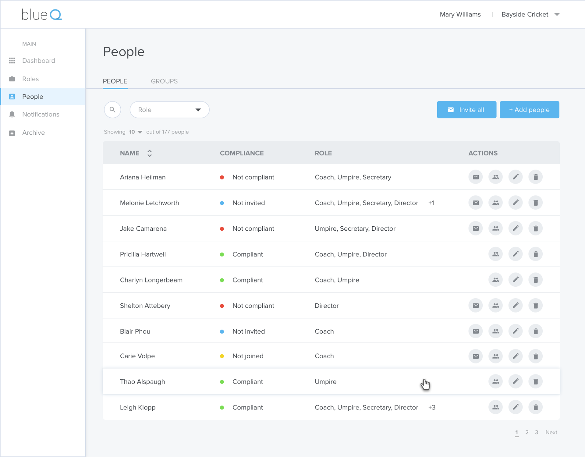
Although it was not part of my scope for this project, I have had a go at a conceptual UI redesign to make it visually light-weight and more appealing.
Learnings and reflections
It was a challenging and interesting project, which gave me an opportunity to learn a lot about various aspects of user onboarding. In particular, starting with the AHA moments and milestones, and working back how to bring the user there.
